UX / UI
MOBILE APP
WEBSITE
A TRANSACTIONAL PLATFORM FOR A MAJOR INDIAN FINANCIAL SERVICE
DOMAIN
FINTECH
OVERVIEW
Our brief was to create a Pre-Sales Transactional Platform (Mobile &
Desktop. for near-instant processing and disbursal of pre-approved financial offers like loans, insurance, and cards. We targeted to enhance the user experience for playful interactions and a quick 3-step loan application format for a young audience.
MY ROLE
Leading the UX design
Content writing for products
The sole point of contact for the client
Prototyping interaction design
Supporting adjacent UI team
PROJECT DURATION
1 month

PROBLEM STATEMENT
Owing to the business’ scattered showcase of financial products on various websites/channels, it was becoming difficult to track sales. The unified transactional platform also had to have a ‘fresh’ experience for the user but also encompass the rigorous marketing techniques of its fragmented counterparts.
OUR APPROACH
The client wanted to launch a loan and credit generation platform that would be used to
up-sell and cross-sell their financial services. Being a financial institution that catered to two-tier city customers, they wanted the simplicity of language and the allure of a modern interface. Creating a multi-channel experience for all types of customers was becoming a pain point for the client and wanted a one-stop-shop for most of their customers.
Our process to understand the problem statement:
%20copy.jpg)
Discovery
Secondary Research
User to behaviour mapping

Definition
Content Bucketing

Solutioning
UX Writing
Wireframing

Completion and Learning
User flows, Journey Map
Discovery: Identifying stakeholders and best practices
After conducting a competitive analysis and user behavior mapping we realized that the platform needed to be tailored for different kinds of customers for lead generation and sales.
PRODUCT AND COMPETITIVE BENCHMARKING


Image L-R: Homepages of Simple Bank, American Express & Amazon
INSIGHTS
After competitive analysis, we concluded:
Major Products that were sold are Home Loans, Personal Loans, EMI Card, Virtual Credits Card, and Pocket Insurance. Also,

The interface to mimic an e-commerce behaviour with aggressive marketing techniques

Quick and easy transaction with no more than a 3-step procedure to hold user's attention

Each type of user should see personalized content

The visuals needed to be elegant, attractive and functional to use.
USER TO BEHAVIOUR MAPPING
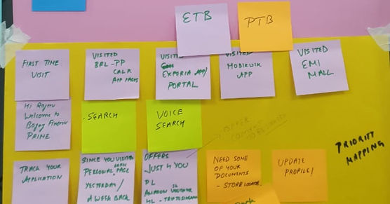
Priority Mapping
Who are our customers?
Through a workshop session with stakeholders, we identified our customer types.
The user types we focussed on were:
First Time Buyer (FTB)
Potential Buyer (PTB)
Existing Buyer (ETB)/Second Time Buyer (STB)
Behaviour Mapping for Personalized Content
How do they think?
We did a behaviour mapping exercise and zeroed down to showing relavent marketing content based on a user’s interest, behaviour and location.
The content focussed on their recently searched products, curated offers, and
up-selling/cross-selling financial services.

Image Left: In the light of setting features, we also made Priority Map to ideate possible user actions that can be nudged.
Image Right: Behaviour Map

Defining
MAPPING OUR FEATURES
Navigation for transaction in 1-2-3 steps
How does the product function?
Since users could browse the platform without logging in, the entire journey was split into pre-login and post-login.
While designing, we realized that transactions of financial products are hard to understand for a layman, hence we laid considerable emphasis on FAQs and guided journeys.
1
2
3
Image: User flow for purchasing a credit card
Journey mapping
What does our system look like?

Solutions
SOLUTIONING IN WIREFRAMES
Persuasive content and E-commerce feel
How do we make them buy?
Given is a detailed screen for selling a pre-approved EMI Card. The screen has personalized offers based on the user’s previous purchase history, location, and interests. We did extensive research and learned to write creative marketing content. The tone was set to be of a friendly salesperson one would meet in a store.

At this point, due to the tight deadlines of this project, I was heading a team of 7 designers who were onboarded to complete the wireframing and visual designs. My responsibility was extended to managing daily MVPs and creating multiple iterations of wireframes.
Interaction Design
Interaction Design was an important aspect of making the user experience engaging and unique. We thoroughly iterated the animation and fixed on an interaction that was seamless yet interesting.

Closer to the finish line
We designed 12 screens that delivered seemless and fast transaction experience. This included upselling/cross-selling products, calculating loan amounts, and redeeming credit points. Maintaining the focus on dynamic content that could be generated through back-end systems, the below was an overall wireframe flow of the mobile application. The same was translated to the website.

Completion and learning
Impact on User Interface
Since the users were from 3-tier and 2-tier cities in India, we created visual designs that looked aspirational for the audience. Hence we used lots of images, icons, and unique pop of colours.
-
The project hit a pause after the design of the product due to varying priorities by the client.
-
To conclude, this project was the defining point for me as a well-rounded Product designer and leader.
-
Content writing for sales was one of the most significant skills I developed.
-
I also got an opportunity to lead a team of 7 designers and motivate them to work tirelessly till delivery.
-
Since I was working on the client site, my relations with the client improved and I made strong connects with new teams and colleagues.

Learnings and Limitations


